Last Tuesday Paul van Herpt and I traveled to Lille for a special Machine Learning and Cycling Masterclass. As data partner of Soudal Quick-Step Pro Cycling Team, these are exactly the applications that touch where we as Transfer Solutions can make the difference. Hence Paul and I followed this special course from the IDLab (UGent – UAntwerpen – imec).
The author (left) and Paul van Herpt at the Masterclass Machine Learning in Lille.
Machine learning is already used a lot in sports. In soccer, for example, a huge amount of statistics is at hand: who has how long ball contact, who usually shoots to whom, makes the most runs, who is the most dangerous? That kind of data is already very easily traceable. And in tennis, it is easy to track the ball, calculate speed, etc..
Aniel, me and Transfer Solutions CTO Albert Leenders at a sponsor event last Saturday in Ede.
Aniel and me have been doing this for the 3rd year now. And we noticed quite big differences in proceeds per location. You’d think large crowds (like on Dam Square in Amsterdam) would guarantee large amounts of donations. Not so. A more humble place like my home town Gouda outdid them by a factor of 9 in the same year!
Conferences are a great way to learn diverse topics in your field. That’s why I like to go to events like Pycons and last Friday, PyGrunn. PyGrunn is a Python event in Groningen, the Netherlands. I submitted two talks for the event myself. One of them was selected.
Here is a recap of the talks I attended and the stuff I learned, so you maybe get inspired to attend Python conferences and even speak at these events.
Keeping your Python in check – Mark Boer
Python was originally developed to make coding more accessible. Where at other programming languages you had to tell what type of data type your variables are, Python deduced this automatically. Good for beginning coders, maybe not so good for advanced data solutions.
Mark Boer has experience in strong typing in his data science solutions. He shared how you can ensure typing in different ways: in data classes, using Pydantic and named tuples. The talk assumed that the attendees already had experience with typing. I had not, so it was a lot to take in. But if I can review the video in a few weeks, I hope to catch on.
Originally I wanted to write a blogpost about what data engineers are going to do with AI writing their code. But before I can write that, I need to share my experiences so far. Because from this you’ll get an idea where they work and where they lack.
This is not meant as a treatise of AI coding assistants and agentic AI tools. But here are some of the tools I’ve tried:
I’ve worked with VSCode and Copilot now for at least a year.
I regularly use ChatGPT and Phind.com for advice on programming tasks.
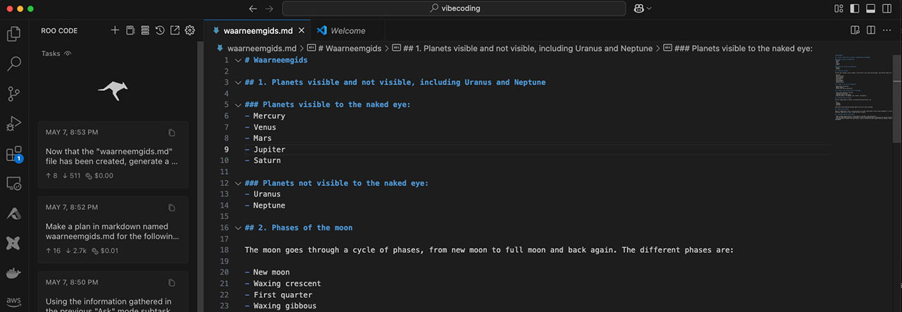
I’ve used VSCode with Cline / Roo Code extensions and LLM models.
And I’ve used Claude Code (which is not free, but there seems to be a trial amount of free tokens). Claude Code works from the command line.
The agentic AI solutions are interesting. They are quite capable to create whole Python projects based on your requests. But it doesn’t mean these projects will work right out of the box. Usually there needs to be some tweaking and restarting and checking results.
When you got a dataset to explore, there are several ways to do that in PySpark. You can do a describe or a summary. But if you want something a little more advanced, and if you want to get a bit of a view of what is in there, you might want to go data profiling.
Older documentation might point you to Pandas profiling, but this functionality is now part of the Python package ydata-profiling (which is imported as ydata_profiling).
I’ve been following this blog on starting with ydata-profiling:
Getting ydata-profiling to work is not exactly a walk in the park. You’d think you can just feed it your messy dataset and it will show you what the data is like. But I encountered some problems:
I got errors about missing Python packages in some situations.
ydata doesn’t seem to like dataframes with only string columns.
At my last customer I have extensively worked with Ataccama, a data management product. It has a data catalog to store metadata on datasets, and it can do data quality checks. In Azure Microsoft has a data management product too. It’s called Purview and I’ve used it in a PoC project.
A very short intro into data management
There’s more to data management than data catalogs and data quality, but I don’t want to rewrite the DAMA-MBOK book. I’ll try to keep this intro pretty short.
Data catalogs have metadata on your data. In this you can find what a table is for, what data in a column means. So that you create data products on the right data with the right kind of outcomes. And also important, who you can contact for more information on that data.
With data quality checks you “profile” a table to see what the data is like: are there NULLs? How many distinct values?. You can then apply data quality rules to make sure that the data adheres to certain rules. Rules like “there should always be a value in this column”, “the data should always be one of a certain number of values”, “the mail column should always be formatted as x@y.z”. Some data management tools allow to create very complex rules.
Purview
Purview got a pretty extensive redesign recently. Last November it got a new portal and the licensing model also recently changed. Last year we paid about 450 euros per month, now it’s “pay as you go”. I think it’s cheaper for most customers who start with data management, but I don’t have direct access to our cloud bills.
To start using Purview in Azure, you need to create a Purview account. I’ve created one last year, but things have changed quite a bit since then. Better to follow Microsoft’s instructions. Important to know: the Purview account is also a managed identity. The managed identity has the same name as the Purview account.
A couple of things you need to know working with Purview. Say you want to use it as data catalog and for data quality on a simple SQL database. These are, in short, the steps you need to take to get all the way to data quality profiling:
Create a “collection” (under Data Map, Domains).
Add a data source. (Connect to your database).
Do a scan on the data source (to find tables and views).
Create a governance domain (under Unified Catalog).
Create a data product and add relevant tables and views to that.
Profile your data (data quality).
My PoC project
Purview has extensive capabilities, but let’s start simple. These are the things I want to achieve:
Allow Purview access to my Azure SQL database.
Scan for tables and views.
Add metadata on these tables and views in the data catalog.
Do data quality checks.
To test the data quality checks I have created a specific table with pretty bad data quality: all columns are strings. Date columns don’t adhere to one format. The status column should have three possible values (“pending”, “completed” or “failed”). And the amount column should of course have numeric values.
A table with bad data quality
Database access
I would love to tell you that I have tested Purview on all Azure data storage solutions known to man, but in fact getting access to a simple SQL database was already a challenge. I’ve chosen to use a managed identity. There are two ways to do that:
Create your own managed identity. Allow Purview to use it and give it access to the SQL database.
Use the managed identity of your Purview account. Give it access to the SQL database.
Long story short: I had the most success with the managed identity of the Purview account. Using my own managed identity did work with a data source scan, but with data quality scans it would not appear as an option. I’ve asked questions about this at the MS community / Learn site and found out the solution myself.
To give Purview access, create a user based on a managed identity and give it access:
CREATE USER [mypurviewaccount] FROM EXTERNAL PROVIDER;
EXEC sp_addrolemember 'db_datareader', [mypurviewaccount]
EXEC sp_addrolemember 'db_datawriter', [mypurviewaccount]
With this access you should be able to do both scans on the data source and data quality profiling.
Data catalog
Once you’ve created the collections and data source and done the data source scan, the data catalog works pretty straightforward. You can add descriptions to the table and columns.
And you can add data experts and owners. Which is useful if anyone has questions.
In the Schema you can add classifications. For example you can add classifications for Personal Identifiable Information (PII).
There also is functionality for lineage. But I didn’t get lineage discovery (preview feature) working with my managed identity.
Getting data quality profiling working
You’d think that with the data scan done, you’re a small step removed from doing a data quality profiling run. Not quite. For data quality profiling runs you need to have a data product. And to have a data product, you need a governance domain. You can do all that under the Unified Catalog. I’m not going into detail here how to do that. It’s not the hard part.
Unfortunately you need to define a new connection for data quality profiling (though it can reuse Data Source settings). And every time I haven’t used Purview for a while, I forget where in the Purview menus that is situated. So let me document that here. Under Unified Catalog, go to Health management > Data quality. Go to the governance domain, Manage and Connections:
Here I also used the Purview managed identity mentioned above. The other managed identity I created didn’t appear as an option.
Data quality: profiling
With all that settled we should be able to do a data quality profiling run. Remember that table with poor data quality? Let’s see what Purview makes of it. This is the profile page for the table after the profile data run:
Except for transaction_id all columns are nvarchar(255). But Purview detects that amount and customer_id are numbers and date is Date/Time. So far so good.
Lets look at the date column:
So what do we see here? Dates formatted as yyyy-mm-dd. No null values. 7940 rows (of 10,000 rows!). Now lets look at this table in DBeaver:
I see many, many different date formats. This was not worth mentioning?
Same with the amount column.
You’d think that the non numeric values would be worth a mention. A warning of some sort. But the only way I can deduce that there could be some kind of problem, is that the total number of rows in this column is not the total number of rows in the table.
And let’s look at the status column.
Here Purview has found empty values. You get a good view of the distribution of the 4 occurring values.
Data quality: rules
We need clearly need to set some rules here. Like:
The status column should not be NULL/empty.
The status column should only have values of this list: “completed”, “pending” and “failed”.
The date column should adhere to the yyyy-mm-dd format.
The amount column should be numeric.
The customer_id column should be an integer (ideally it would be a customer_id that exists in a customer table somewhere).
Let’s start with a rule that the status column should have no empty or blank values. For this there is an existing rule type.
I pick the status column, add a description of the rule and click create. Then I do a quality scan. Here is the result:
Wait! What!? A score of 100! This is my data:
There are definitely empty values. Does this rule only check for empty strings and not NULL values? If so, why isn’t there a NULL rule check I can choose from? It’s a problem many people have. (Later I’ve created a custom rule with the notNull expression. Again I got a score of 100. There’s definitely a bug in that expression.)
For the date column I went with a string format match, with a regular expression that checks for the yyyy-mm-dd format:
That is a good result. Not the data quality of this column, but that the bad quality was detected.
Let’s make a rule that the amount column is numeric. Data type match seems to be a logical choice.
But I can’t choose the desired data type.
And the result is a quality score of 100. What?!
It’s starting to look a lot that I will be choosing Custom rules most of the time:
There’s a lot to choose from here. But at least I can pick a very specific rule that does what I want:
I ran a new quality scan and the result is that it found 1004 rows failed. So the rule works.
In the end you will get a total data quality score for your table. Here are the results per rule:
Here you can see that the total quality is medium.
When I applied all rules I wanted (as described above) the total score was 81.8%, which was marked as quality score “High”.
Combined with the data quality scans for the whole governance domain HR the total score is 90.9 or “High”. I guess we’re done here.
Let’s be fair, when you average out data quality scores for all your tables, it’s likely you get high marks in any data management tool. It might fool your management, but not the end users.
Conclusion
Purview has enough to get started with data management on your Azure cloud. Connecting Purview to my SQL database was harder than I assumed it would be. And not everything is documented.
The data catalog is as you would expect. Other data management products can also detect phone numbers, mail addresses and other PII data. Purview is definitely not there yet.
The results of the data quality profiling are confusing. You’d expect all alarm bells would go off for a table with such poor quality. Just a data quality profiling run is not very useful. You’ll have to create rules. The result of the empty/blank fields rule was just wrong. And I can see myself creating custom rule after custom rule to get the real data quality checks that I need.
Currently I’m helping colleagues to read open data in Azure Data Fabric. Here are some of my experiences with it.
I don’t want to do an extensive description of what Data Fabric is. In short, if you have an organisational Azure account, you can enable Data Fabric. You can then create Fabric workspaces and within workspaces you can create lakehouses for storage, pipelines and notebooks for automation. Lakehouses are like data lakes that act a bit like data warehouses with schemas, tables etc.. So you can store unstructured data in them as files, but also have tables you can read with SQL.
Notebooks are quite nice
You can automate stuff by calling notebooks with Python. And the nice thing about that, is that you can add text formatted with Markdown. So you can add nicely formatted documentation about what steps in your notebook are doing.
So it’s code, but it’s also documentation.
Lakehouses need time to start
One of the features data lakehouses bring, is the separation of compute and storage. Storage is cheap and it can stay online. But compute (CPU, GPU) is expensive and you want to not be billed for those longer than necessary. So compute clusters are automatically deactivated after a while.
That’s great, but when you connect again, they take time to start up. If you create many different lakehouses for different purposes in your Fabric workspace, and if you have pipelines that access many of them, each one of them needs to startup. And this can take minutes.
So better go with one big lakehouse with many schemas for different purposes, I think. Though I’ve also been working with several notebooks on the same lakehouse and then I got a message I could only connect with one notebook to a lakehouse at the time.
Where are my files in a lakehouse?
When you’re not familiar with lakehouses yet, and you created files to be stored in the lakehouse, you sometimes wonder: where are they?
Know that the lakehouse explorer has two modes, and the default one (I think) is SQL analytics endpoint. There you won’t see any files. Switch to Lakehouse view and you’ll see the file side of things.
Fabric has Data Factory, but with less debug
I’m not exactly a fan of low-code solutions. I’ve been working with some. Debug seems always to be lacking for one thing. In Azure Data Factory does have debug features actually. But the variant of Data Factory in Data Fabric doesn’t have those debug features. So when you don’t understand what data is going through the pipeline, your only hope is writing the in between data in files or tables.
For example, I have this Lookup action that reads a table with dataset names. And in the Copy data1_copy1 action it is supposed to do an Odata call and store the results that come back. The Lookup1 action does have a preview data option. But there’s no clear way what the pipeline is doing in subsequent actions, what data went through the pipeline. So I’m still quite in the dark why this pipeline is writing the results of each Odata call to all the lakehouse files.
You can also use a Get Metadata action in between. But chances are that if you wanted to use Get Metadata to investigate a failing action that comes after, Get Metadata is now the failing action.
Meanwhile, notebooks do have all the logging and debugging data you’d could want. So if it is up to me, I wouldn’t go with Data Factory pipelines.
Where are my connections?
In Data Factory I find pipelines within pipelines within pipelines already hard to maintain. But then there are connections. Once you have created a connection (to an Odata source or another workspace or pipeline) it is really difficult to find it back.
I think it was last year when I announced that I wanted to go back to conferences again. Preferably as a speaker. But what conference is the best for data engineers? I couldn’t quite figure it out. Then the call for papers for PyCon Ireland 2024 came by on my socials and I thought “why not Python?” I do lots of it, even though it’s not always work related. And I’ve never been to Ireland. So submitted two sessions. One got selected right away. I booked my flight and hotel and off I went last Friday (November 15 2024).
Day 1
Let me first of all say that I found the quality of the presentations very good. They were interesting and I was able to follow the topics quite well.
Jaroslav Bezděk started off with a talk about pandas and DuckDB. I know pandas, but I wanted to know more about the second one. Jaroslav’s talk confirmed for me what I already suspected: it is not that hard to start with DuckDB. Nice to see some examples. Certainly a tool I want to try out. I found his slides on Github: https://github.com/jardabezdek/talk-zoology-101.
Then it was my turn to talk about e-ink displays. I’ve grown fond of these devices, combined with Raspberry Pi’s. So I discussed 4 ways that I’ve used them. The slides can be found on my Github page: https://github.com/Marcel-Jan/talk-eink-dashboards.
It was so much fun to be a speaker at a conference again and the audience was very welcoming. Many people talked to me after this and my other presentation and it really makes me want to do this more often.
Mihai Creveti talked about what AI agents can and cannot do. I’ve got a clearer picture now what agents are good for. He also gave examples of tools that are used for this currently. There’s so much in the AI landscape nowadays. It’s good to know where the field is going.
The talk about testable pipelines by Florian Stefan was of great interest to me. He showed how he uses DBT (Data Build Tool) with dbt_expectations for testing of pipelines. dbt_expectations is not only useful for testing. It can also check if quantiles of column values fall within an expected values. So that goes further than just of they have expected values.
Mark Smith from MongoDB demoed an AI agent that can send real world text messages with excuses why he could not make it to the office. And by giving that agent a memory, you can make sure it won’t send the same excuses twice. Weird use case, but otherwise a clear application.
Like me, Cosmin Marian Paduraru, has used Python to solve a personal use case. He wanted to know if he could use visual intelligence to identify new items for his collection of bottle caps and avoid duplicates. He showed what technology he used and what obstacles he encountered. And he showed you don’t always need the latest and largest algorithm for this kind of work. And not a bad try for his first presentation at a conference ever.
James Shields from Bank of America talked about how to get a culture of innovation at your company. I speak from experience that getting a culture of innovation can be hard. It’s hard to get the time, get everyone involved, including management. And even if everyone is willing to innovate, it doesn’t always happen. At Bank of America they use hackathons. And even that is not everyone’s cup of tea. But still they are making great progress.
The Github ecosystem does not only support DevOps but it can also support DevSecOps. That’s what the talk by Eoin and Tom Halpin was about. They showed with a down to earth example how they use Github Actions and Workflows to not only do automated testing, but also do vulnerability scans. You can find their repo here: https://github.com/genai-musings/chatting-with-ChatGPT. I finally understand what these badges are for on the Github page. Certainly something I want to try out BTW.
Next I went to Paul Minogue’s presentation about vector databases. He discussed what vector databases are good for and shared his research on this matter. There were some surprises for me. For example that OpenSearch can be applied as a good vector data store. He also shared the challenges he encountered. I already knew about embeddings, but I’ve learned a lot about the ways you can search through embeddings if there are a lot of them and performance is not good enough.
Florenz Hollebrandse discussed the modular approach they use at JPMorganChase to make sure that when choosing solutions they don’t paint themselves into a corner. They decouple business logic from platform/deployment concerns. This way they are able to reuse more generic software. JPMorganChase open sourced a solution for this, which you can find on Github: https://github.com/jpmorganchase/inference-server.
Then it was my turn again. I was asked if I could prepare my other submission as a backup presentation. So I finished my presentation on how I used Python to prepare for my astronomy podcast the evening before, on my hotelroom. I had a lot to share about how I use ChatGPT to categorise astronomy news articles, how I use embeddings to find similar articles that don’t need categorising anymore (reduces the bill). And flattening the embeddings to 2D or 3D allows you to make nice graphs. My slides can be found here: https://github.com/Marcel-Jan/talk-python-astropodcast
And then there were the lightning talks where people can quickly share a topic of interest. It doesn’t always have to be directly Python related. That’s why the Swedish vessel called Vasa that sunk fairly quickly after barely leaving the harbour (“I’ve been projects on this before”). But also a daring demo of pre-commit, a tool that won’t let you commit unless your code adheres to certain standards. And about creating a Telegram bot with Firestore.
The day ended with pizza and fries. And good conversations with people I didn’t know before. This is such a nice community with many people wanting to share their knowledge with everyone else. It’s heart warming.
Day 2
On day 2 you could follow all kinds of workshops. And yes, a lot of them were RAG and AI agent related. A nice chance to try that out.
So I learned to use a vector database (MongoDB) and RAG to create an agent. And an important concept I learned here was chunking, which is used to break up text to make it possible for the agent to work faster.
Then I thought about following a workshop on scraping, but the room was already very full. So why not do more RAG? You can never do enough RAG. So I followed Shekhar Koirala’s and Shushanta Pudasaini’s workshop, which was about multi-model RAG. What that meant was that you feed your RAG software a PDF and it will separately get text, images and tables out of it. Which you then later can use in an agent.
And lastly I followed Cheuk Ting Ho’s workshop on Polars with Polar extensions. Polars is pandas’ faster sister. For this it has been programmed in Rust. So for the first time I’ve installed Rust on my laptop. I managed to follow the entire workshop. There’s still a lot I need to know before I can implement this on site. But I’ve got a bit of the hang of it.
And that was the end of Pycon Ireland 2024. I must say I’ve enjoyed it very much.
I stepped out of the Raddison Blu and finding myself to find a new purpose of the next of the day. I decided to explore the area of Trinity College a little bit. Because tomorrow I want to visit the Old Library. And a couple of other sights in the area.
I’ve also very much enjoyed dinner. I went to The Winding Stair next to the river Liffey. What an excellent restaurant. I’ll likely visit them again later this week.
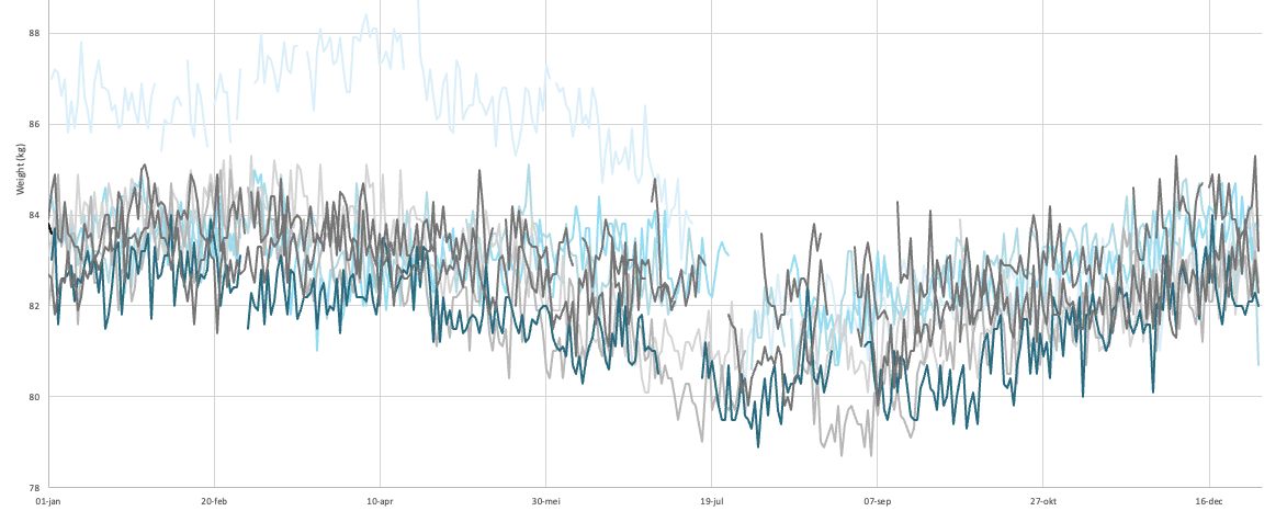
For several years I kept track of my weight and fat with a Soehnle Body Balance, which I bought in 2018. That worked quite well until I saw more and more these weird deviations. Take a look at the red line (fat percentage) in the graph below:
I’ve been training harder in the last 2 years, but according to the fat measurements I gained more fat, not less. And also, after a day of a long bike ride, the fat percentage would peak the next day, instead of getting lower. In the last few months I would regularly get fat percentage measurements of 30+%. And it was not like I was eating burgers, fries and ice cream everyday. It didn’t look like the fat measurements were very accurate anymore.
My new scale
I decided it was time for a new personal scale. After some deliberation I picked the Robi S11. It is a “Smart body composition scale” according to the brochure. It has a handheld device that measures your body fat (and a whole lot of other things) more accurately. It is similar to how my doctor measures my fat percentage during my half yearly checkup. And it was moderately priced.
Now this is one of those scales that has a Bluetooth connection. I’ve always had a healthy mistrust of sharing my health data with apps like these. Especially when the parent company is one Guandong Icomon Technology. Who knows where your data goes to and how securely it is stored?
I decided to give their Fitdays app a try anyway. I filled in the limited amount of personal details (and not all of them entirely accurate). And of course I didn’t give the app any more access to iPhone data than absolutely necessary. For what it’s worth.
The device does an impressive amount of measurements. It measures not just weight, fat, water and muscle tissue. It can do so per arm and leg. And somehow it also can measure bone mass and protein mass in your body. Not sure how accurate and scientific all this is though.
The app shows all these results. And then came the little matter of me wanting to copy all that data. Luckily the app has a “share” option. I was able to Airdrop that data to my MacBook. So I was excited… until I got said data. Because it was in the form of a jpeg file.
Example of the data in jpeg form (only top part because the image is very long).
Your data, in jpeg form
You can’t copy the values. You can’t get the data in any other form. Good luck!
Good luck? Well we’ll see about that. I decided to summon the power of Python! Surely there must be some way to OCR the heck out of this jpg? And, as almost ever, there is a Python solution. Quite quickly I learned there is a Python package called pytesseract that can do OCR.
Using pytesseract for OCR
For a first attempt the code is fairly simple:
import pytesseract
from PIL import Image
im = Image.open("IMG_69EC2B66C329-1.jpeg") # the ROBI image with data
text = pytesseract.image_to_string(im)
print(text)
And sure enough, when you run it, you get this result:
Now all I have to do is select the lines with the data that I want, write it to a cleaned up data output, and I have my data in consumable form.
I got a lot of data out of this. But not all. For example, on this multiline name it would get the text, but value was wrong:
As you can see in the result here:
Vetvrij
lichaamsgewicht 878k
It was probably confused by the value being in the middle of the multiline name?
Also it would not get the text from this part with the human image:
It would not get the numbers here (except the “Standard range”):
Segmentale vetanalyse
Standaardbereik: 80%-160%
Standaard
Standaard \\ Standaard
l R l
Maybe that’s something to look into in a later phase.
In any case, I was pretty happy about how easy it was to get the first results. I got enough out of it to start with. Hiding my data in a jpeg is no match for some rudimentary Python skills anymore.
I’ve been thinking how to improve the quality of the results from pytesseract. One approach is to cut parts of the image out, so it can “focus” on these.
But I also read you can do other forms of preprocessing of the image that can help. Like what I read in this post:
I also want to store my data in a .sqlite database in the future. Now it’s still an Excel sheet. But I could do more in SQL. Maybe make a data warehouse of my own personal data.
These Python and Raspberry Pi projects. They are fun aren’t they? And often they look deceptively simple. But you don’t see all the projects that failed and usually not where they struggled. This project got stuck (and almost failed) at:
Not being able to scrape dynamic website content.
When I found out how to do that, I couldn’t run my working Python code on the Raspberry Pi.
That turned out to be because the scraping packages use a chromium browser, but not for the ARM processor that the Raspberry Pi has.
And to top it all off, the Python package for the Inky Impression e-ink display had some kind of problem running numpy.